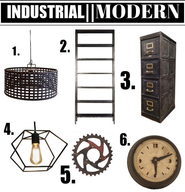
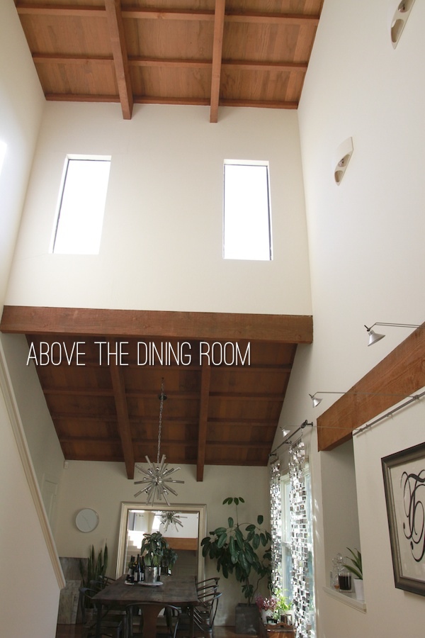
When we moved into the house I grew up in, it took me awhile to figure out how our design taste would be represented here. Since we have thick wood beams and tall ceilings on the main floor of our house, I thought we’d play with the “rustic” architecture and make things a bit more industrial & modern. If you’re not sure what Industrial Modern looks like, you can get a good sense from my Pinterest Board.
From what I’ve seen, the look requires a few large scale/bold/rustic statement pieces. Steel, old wood, and leather are key materials that best represent the design scheme. Industrial modern seems to work best in more loft-like/warehouse-like spaces because of the scale and proportion. I’m a person who loves BOLD things, so I’ll be adding bits of black to add contrast to the white walls. I may even paint part of the wood ceiling black or white…who knows.
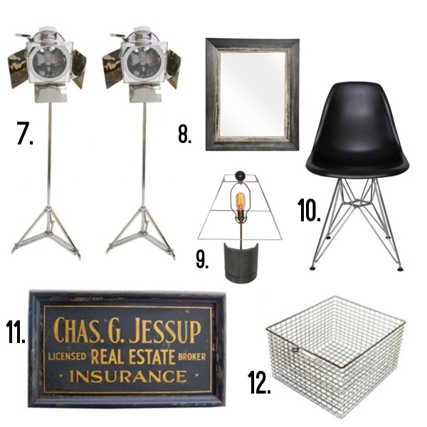
Chairish (an awesome website where you can buy & sell exceptional pre-owned vintage furniture online) asked me to put together a few mood-boards from their inventory so you can see what my home decor vision is in our new/old home. Here’s what I came up with:
ONE/TWO/THREE/FOUR/FIVE/SIX
SEVEN/EIGHT/NINE/TEN/ELEVEN/TWELVE
Some pretty cool pieces, right?
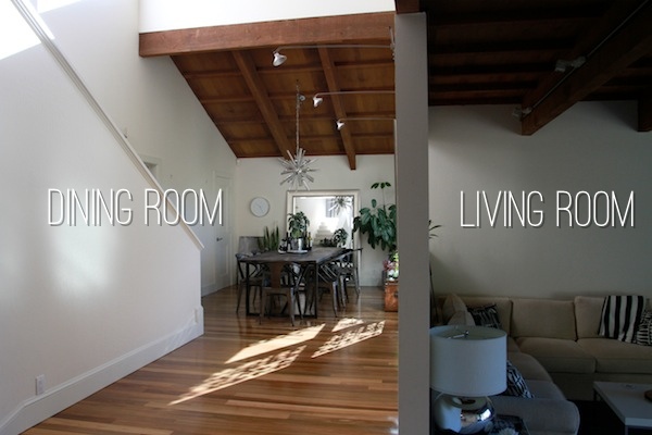
And now let me show you our main floor.
You can see the dining room to the left and the living room to the right. We haven’t really figured out what we’re going to do with the living room yet since it’s an odd shaped room (we’ll get to that later) but you can see really tall/ WOOD CEILINGS!
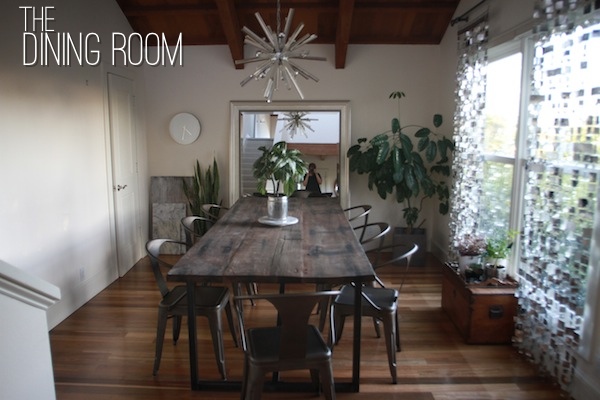
This is the dining room in its current state. We bought our table on sale from Restoration Hardware and chairs are from Overstock. We’ve temporarily propped up my mom’s mirror behind the table (Casey isn’t sure it should stay there) to open up the space and we hung up our vintage Sputnik chandelier from our old house. The dining room isn’t done by any means but I think it’s nice & minimal at this point. I’d love to add a big vintage sign in there somewhere. Something metal or maybe an old Marquee letter? I think this room could use some bold vintage pieces.
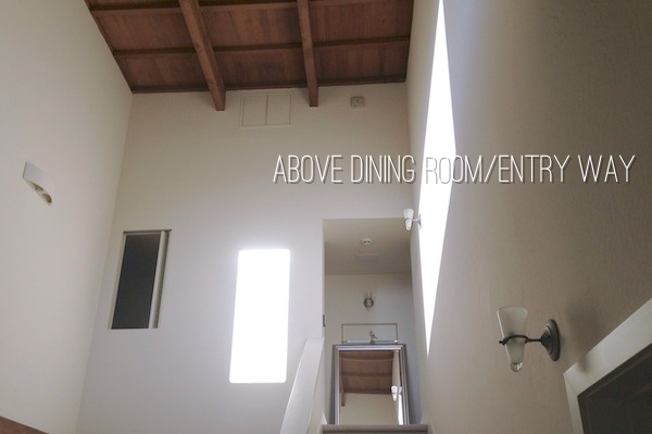
Here’s an overview. I wasn’t kidding about the tall ceilings…
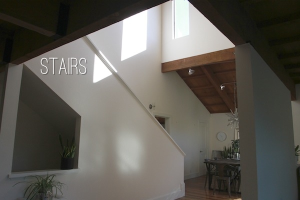
Behind the dining room, we have a set of stairs that leads to the bedrooms. I love the white walls in here. There’s so much light during the day.
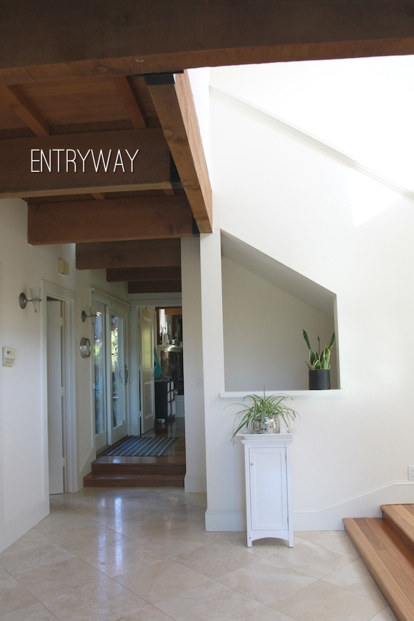
Here’s the front entryway (you can see part of the stairs on the right). The living room is behind this view and if you looked to your right the dining room would be right in front of you. You can see at the end of this hall is our family room where the kitchen is. I’ll post more pictures of that soon. We’re scheming to paint our cabinets and do some cosmetic work in there so stay tuned for that. We have the same sconces throughout the house and I’d like to replace them with something a little more Industrial. We have at least 10 of them to replace though.
Here’s another angle. I’ve thought about painting the stairs black and filing it with art. I’m going to do a mock-up of that so Casey can see my vision.
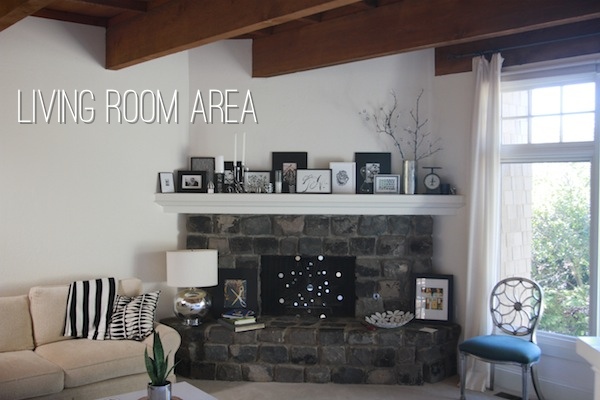
And here’s one half of the living room. I clustered a bunch of frames on the fireplace. I think we might take them down and focus more attention on the wall to the left with something big/bold. This is where something like a big GEAR (like the one I picked above) would come in handy. For now this room just has furniture from our old house occupying it.
I hope that gives you a sense of what our vision is! You can check out more items that fit into our Industrial Modern theme on my collections page at Chairish.
If you’re looking for something unique to add to your home, this is such a fun website to check out. They just created an app for you phone to make listing and buying items even easier.
So let’s talk about that giveaway…
Chairish is providing a $250 credit to one of my readers. All you have to go over to the entry page and enter. A winner will be picked at random and will be contacted as soon as the giveaway is closed on 02/19 @ 11:59 p.m PT.
Good luck! And a big thank you to Chairish for sponsoring this giveaway!


